
The 10 Best Fonts for Your Website Design
Website design encompasses numerous elements such as colors, layout, images, structure, and more. However, in this article, we will focus on a fundamental aspect: typography. Through typography, users perceive the brand identity and read the messages that the company wants to convey, making it crucial in web design.
When choosing a font, readability is the first consideration – the ease with which the text can be read. Additionally, it should be adapted to each part of the text, adjusting its size, color, justification, and alignment, as it defines a significant part of the page's aesthetics. It's important to note that the chosen font should be compatible with all devices and should not be too heavy, as it could slow down the website's loading speed and increase the likelihood of users abandoning it.
Another relevant point to consider is the font used in your company's logo, if you already have one. To maintain consistency, the font chosen for your website should harmonize with the one in your logo.
If you want to discover the best fonts for your website design in Argentina or globally, don't miss this post!
Serif vs sans-serif
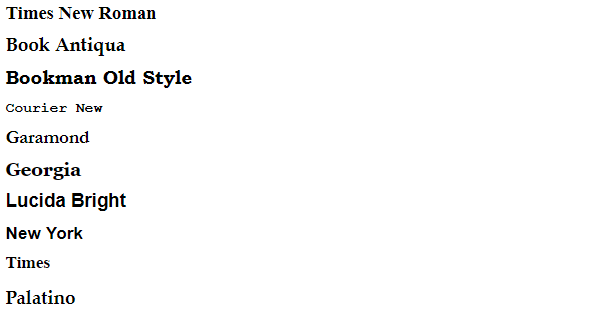
Serif
Serif fonts are characterized by small adornments at the ends of letters, offering a classic, firm, and relaxed yet attractive look.
Recommended for formal, traditional, and serious companies, Serif fonts were historically used in printed books, associated with tranquility and elegance. In certain situations, they can be very appropriate as the serifs, or small decorative strokes, aid in distinguishing letters more easily.
Examples of Serif fonts:
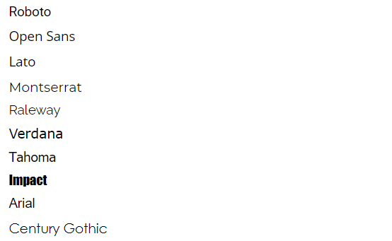
Sans Serif
The term "Sans-serif" comes from French and means "without serifs," defining its character with a lack of details and straight edges. In Spanish, we often refer to them as "fuentes de palo seco" (fonts without flourishes).
Initially viewed with suspicion and mainly used for titles, Sans-serif fonts have gained more popularity over time due to their excellent readability and modern, technological appearance. They work well when there is limited space for text and are a great choice for websites optimized for small screens or low resolution.
Sans-serif fonts have a more minimalist style and are currently among the most popular in Google Fonts.
Examples of Sans-serif fonts:
Recommended Fonts for Your Website
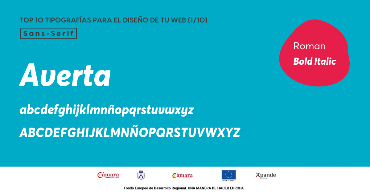
1. Averta
Averta is a simple sans-serif font created by designer Kostas Bastsokas. Its characteristics facilitate content understanding: it's clear, attractive, and visually pleasing, enhancing user navigation.
Ideal for conveying modernity and simplicity to users, suitable for titles or infographics.
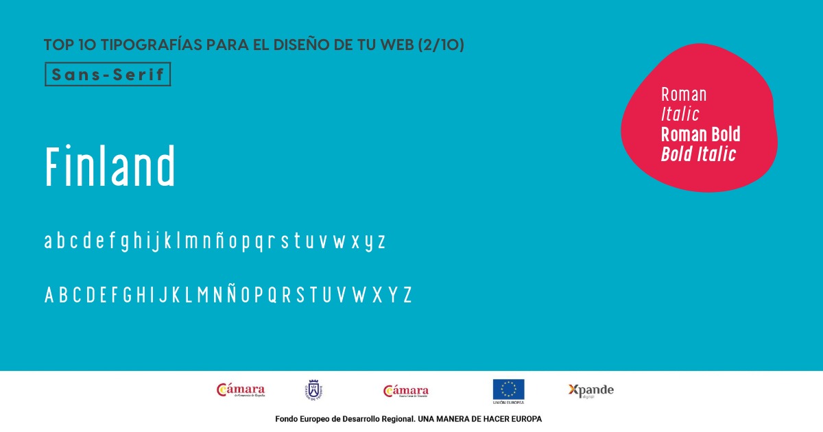
2. Finland
Finland features a geometric sans-serif structure similar to Averta. It evokes trendiness, style, and modernity but isn't recommended for long texts as it may cause visual saturation.
Perfect for titles, headers, and logos due to its characteristics.
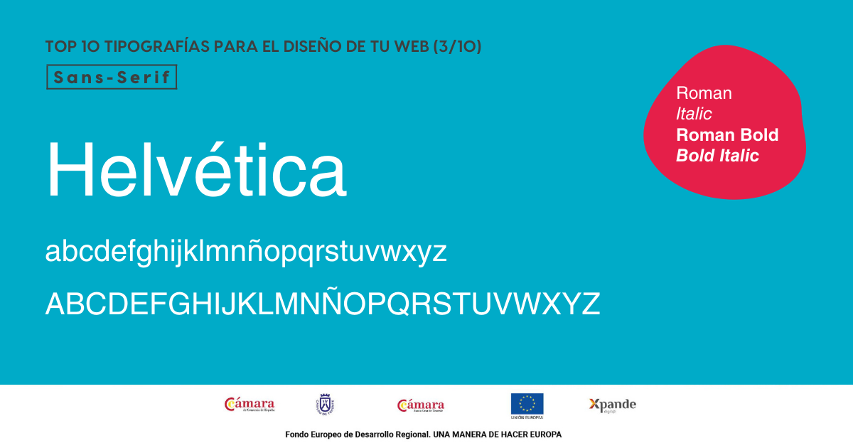
3. Helvética
Neutral, versatile, and highly readable, Helvetica is one of the best typographic choices for your website. A sans-serif font that adapts to almost any context, the Helvetica family has expanded to include Helvetica Now, maintaining its core characteristics with a more modern touch.
Ideal for conveying elegance and clarity on the web, its simplicity and attractiveness make it a favorite among web designers.
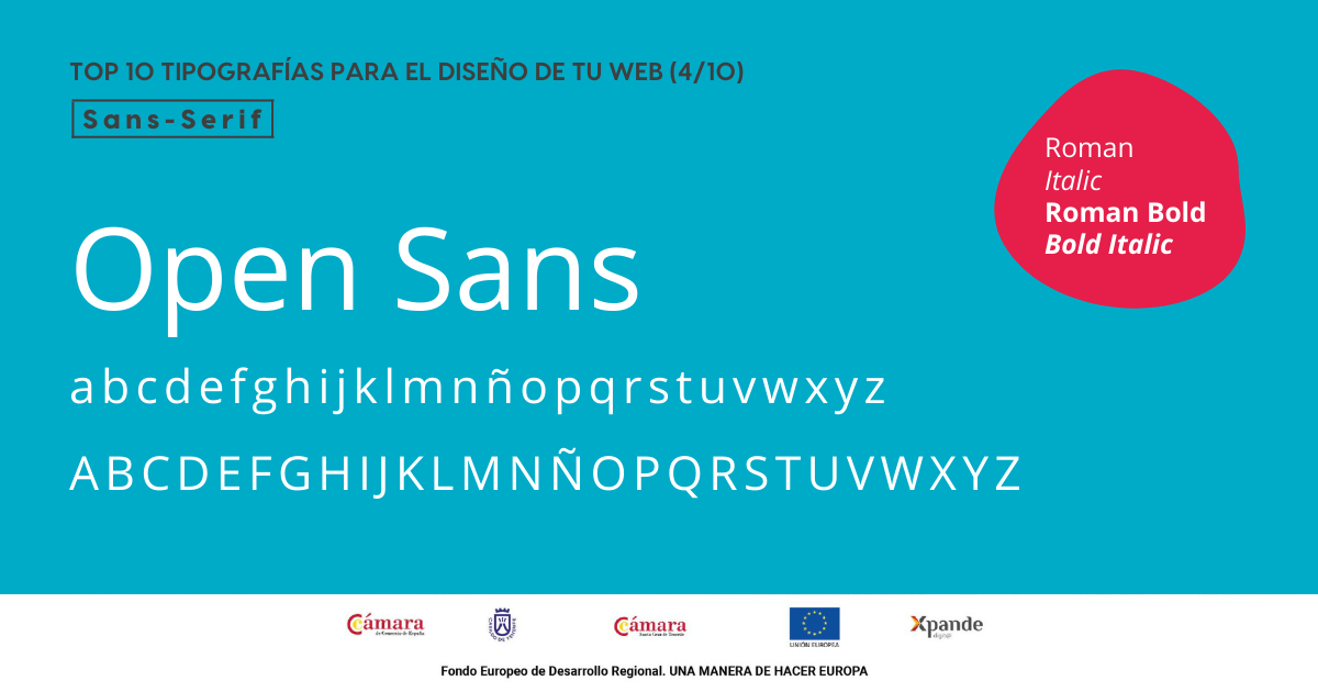
4. Open Sans
A humanist sans-serif font widely used in web design for its high readability on screens and small sizes. Available on Google Fonts, it's a timeless choice known for its versatility.
Ideal for websites aiming for a neutral and friendly appearance, considered a 'classic' among fonts.
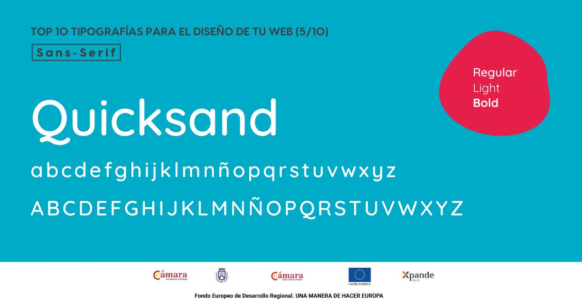
5. Quicksand
A geometric font suitable for both large and small text due to its high legibility. Noted for rounded ends, sinuous strokes, and ample spacing, providing a modern and creative look to web content. The combination of its different styles creates perfect harmony.
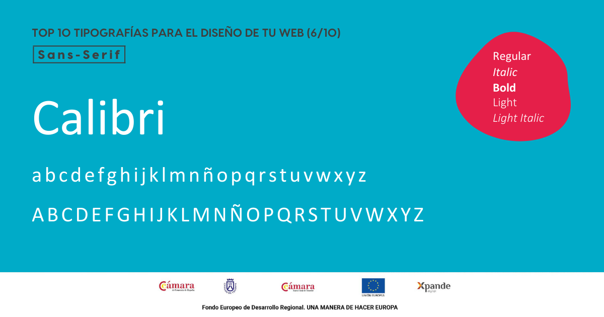
6. Calibri
A familiar sans-serif font with humanistic proportions, rounded corners, and carefully crafted strokes.
Popular on screens, Calibri has gained significant popularity as sans-serif fonts replaced serif ones in applications like Word.
Perfect for any website due to its attractiveness, simplicity, clarity, and readability.
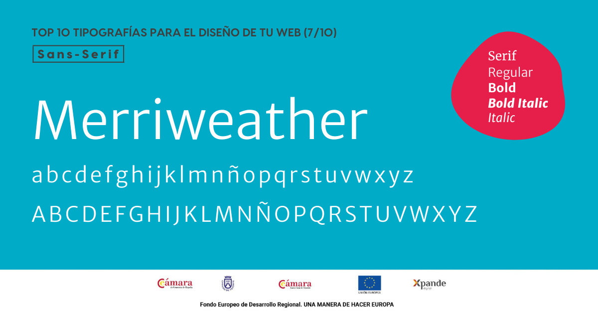
7. Merriweather
Created specifically for screens, Merriweather's design resembles Egyptian writing with a distinctive personality.
Highly versatile, fitting any company and project, it offers a serif version that can be combined for a more elaborate look on the web.
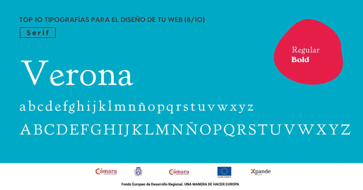
8. Verona
A font with a Roman and modern appearance, providing a classic, intellectual, and refined look to content.
A serif font offering a unique personality to the web, suitable for traditional companies aiming for uniqueness.
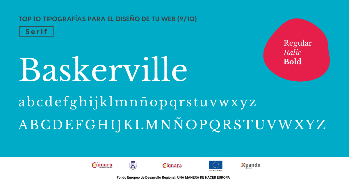
9. Baskerville
An 18th-century Roman font with a classic and transitional character, greatly enhancing screen readability. Thin and thick strokes create a perfect balance for websites with extensive text, ensuring high legibility and clarity.
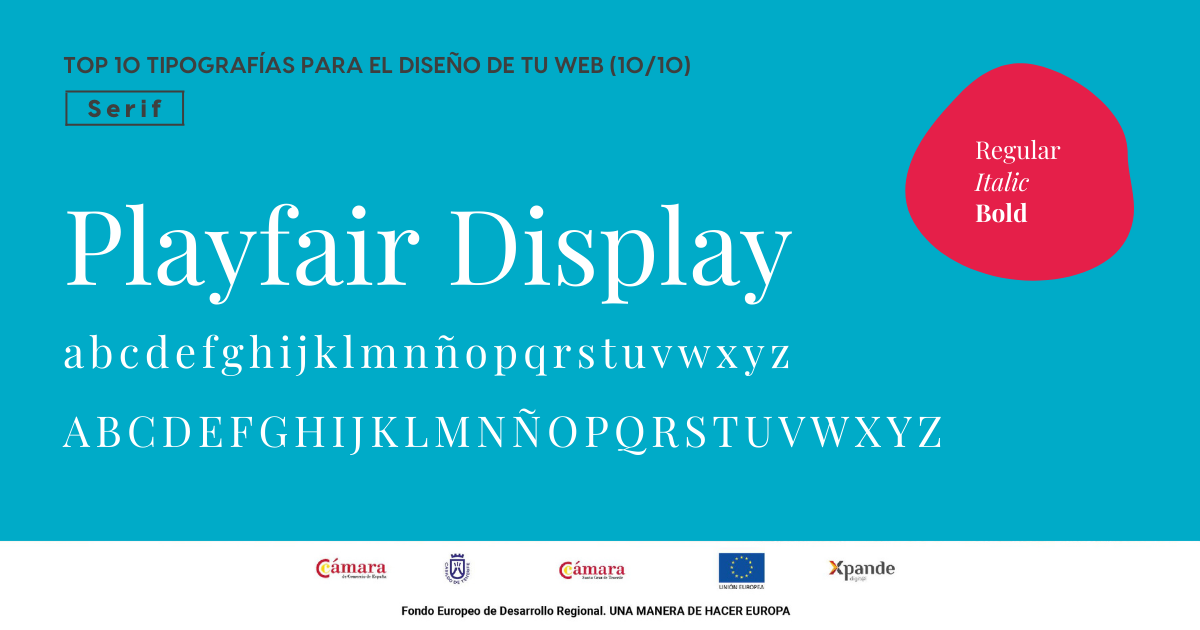
10. Playfair Display
A slim and tall serif font offering an elegant look to the website.
Belonging to the display font group, ideal for large elements like titles, it's also suitable for subtitles when combined with less pronounced fonts in the body text.
The choice of font is a key decision to balance the appearance and personality of the website. Selecting a font aligned with the company's identity is crucial to convey positive feelings to users. The typeface reflects the business image and indirectly provides information about its nature, making it essential to choose appropriately.
For more details on designing your website in Argentina,
feel free to reach out!