Choosing Colors for Your Company's Website: How Colors Affect Customers
Color is crucial when designing a website as it strengthens brand recall, guides users to take specific actions, and ultimately helps increase sales. Colors stimulate the brain, evoke sensations and emotions, and their proper use on a website can bring incredible benefits.
The choice of colors affects how users perceive the website. Colors can evoke feelings of tranquility or risk, convey a classic or modern image, and communicate fun or seriousness, among a myriad of other emotions. Therefore, a good color choice is vital, as it will determine visits, the time a user spends on the site, and potential sales.
Do you want to know which colors best suit your company in Argentina and how to use them? Keep reading!
Tips for Using Colors on the Website:
Balance and Harmony: Regardless of the chosen colors, they should be balanced. It is advisable to use colors from the same range but with different tones, complementary colors, or opposite colors.
Avoid Neon Colors: Neon colors are vibrant and eye-catching in visual art but are annoying to view on a screen. Neon elements can be incorporated to highlight, but they should not be used in sections like text bodies, titles, or menus, as they are uncomfortable for reading.
Avoid Bright Colors on Bright Colors: Like neon colors, bright colors can lead to visual saturation and create an overloaded appearance. Strong colors should be used sparingly and never one on top of another, but rather in small touches or details.
Consider the Target Audience: The target audience of the brand will determine the choice of colors. The gender it is directed to, the product or service range it sells, or the culture it operates in are decisive factors in choosing website colors.
For example, a high-end clothing brand might use black and white colors, conveying quality, excellence, and prestige. Well-known luxury fashion brands like Versace, Chanel, Armani, or Louis Vuitton have white backgrounds and black letters on their websites.
Next, we will provide more information about the colors along with an example image for each of them. It's worth noting that the images are screenshots from the websites of Bakata Solutions' client companies, as we have been involved in their technological development and design.
Colors and Their Associations:
Red
Associated with passion, love, risk, excitement, and energy. It attracts attention and can create a sense of urgency.
 Image: Web of Factorii
Orange
Similar to red, orange creates a sense of urgency and attracts attention. It is ideal for highlighting user actions in e-commerce.
Orange conveys warmth, happiness, energy, excitement, and fun. Excessive use may communicate distrust.
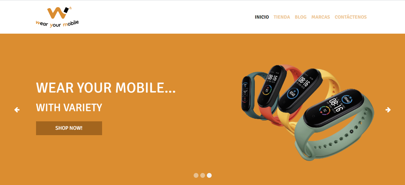 Image: Web of Wear Your Mobile
Yellow
Symbolizing happiness, energy, vitality, optimism, and enthusiasm, yellow is attention-grabbing and suitable for calls to action (CTAs).
However, it should not be overused to avoid a visually aggressive appearance.
For example, on this website of an institutional body within the industrial sector, yellow (energy) is combined with blue (technology and seriousness).
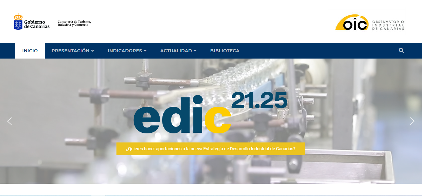 Image: Web of Observatorio Industrial de Canarias
Green
Representing nature, the environment, health, and money, green is ideal for companies related to health, well-being, nature, science, and tourism. It conveys freshness and peace.
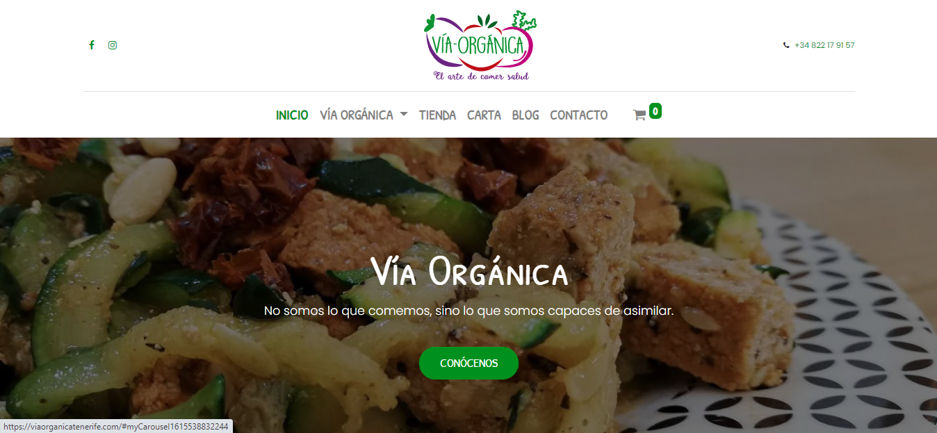 Image: Web of Vía Orgánica
Blue
Symbolizing peace, blue conveys trust, serenity, calmness, tradition, and professionalism. It is recommended for public and financial service websites, as well as companies in health, science, and technology.
Se recomienda para webs de servicios públicos y financieros, así como para empresas del campo de la salud, la ciencia y la tecnología.
 Image: Web of Bakata Solutions
Purple
Associated with luxury, spirituality, ambition, mystery, and wisdom, purple evokes authority, wealth, creativity, intelligence, and imagination. Ideal for luxury brands, astrology, spirituality, and beauty products..
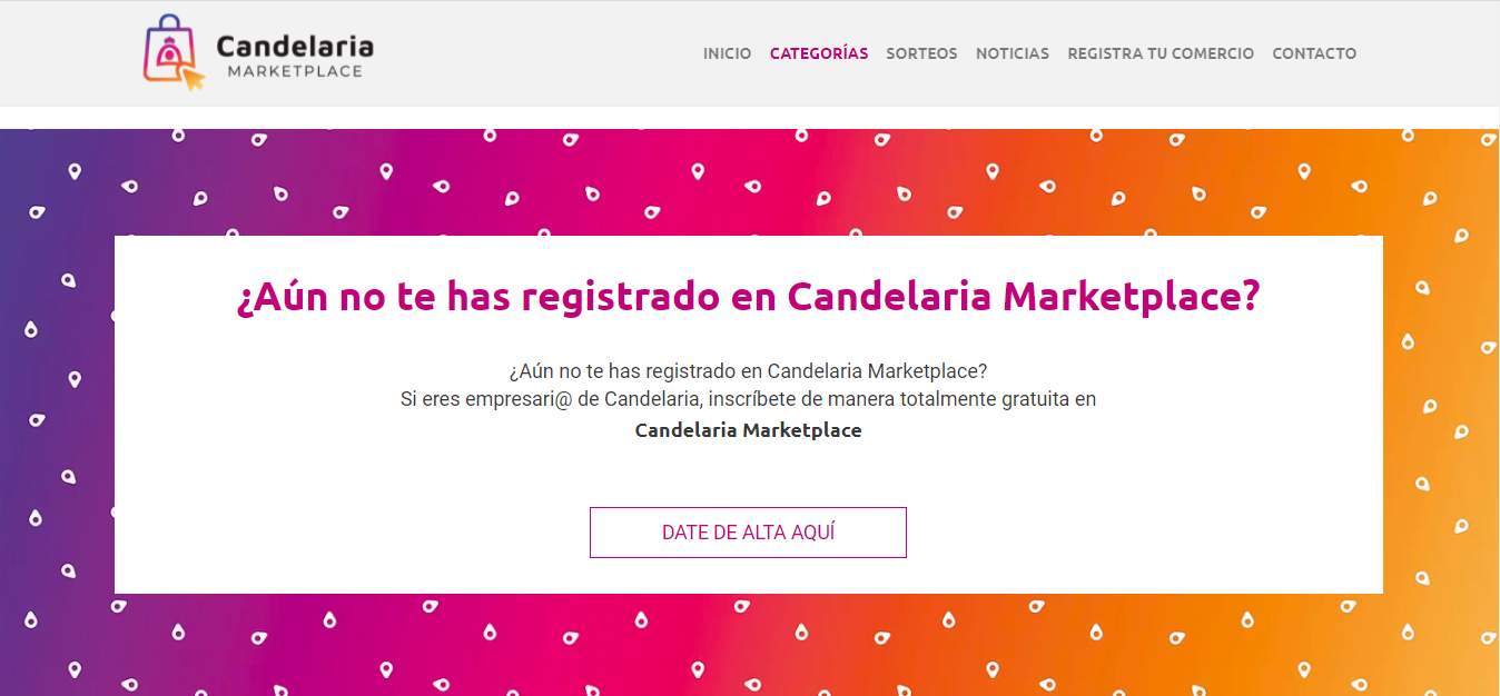 Image: Web of Candelaria Marketplace
Pink
Associated with sophistication, love, and femininity, pink conveys innocence, delicacy, generosity, and sincerity.
Suitable for websites targeting a female or teenage audience and companies in food, sweets, fashion, and trends.
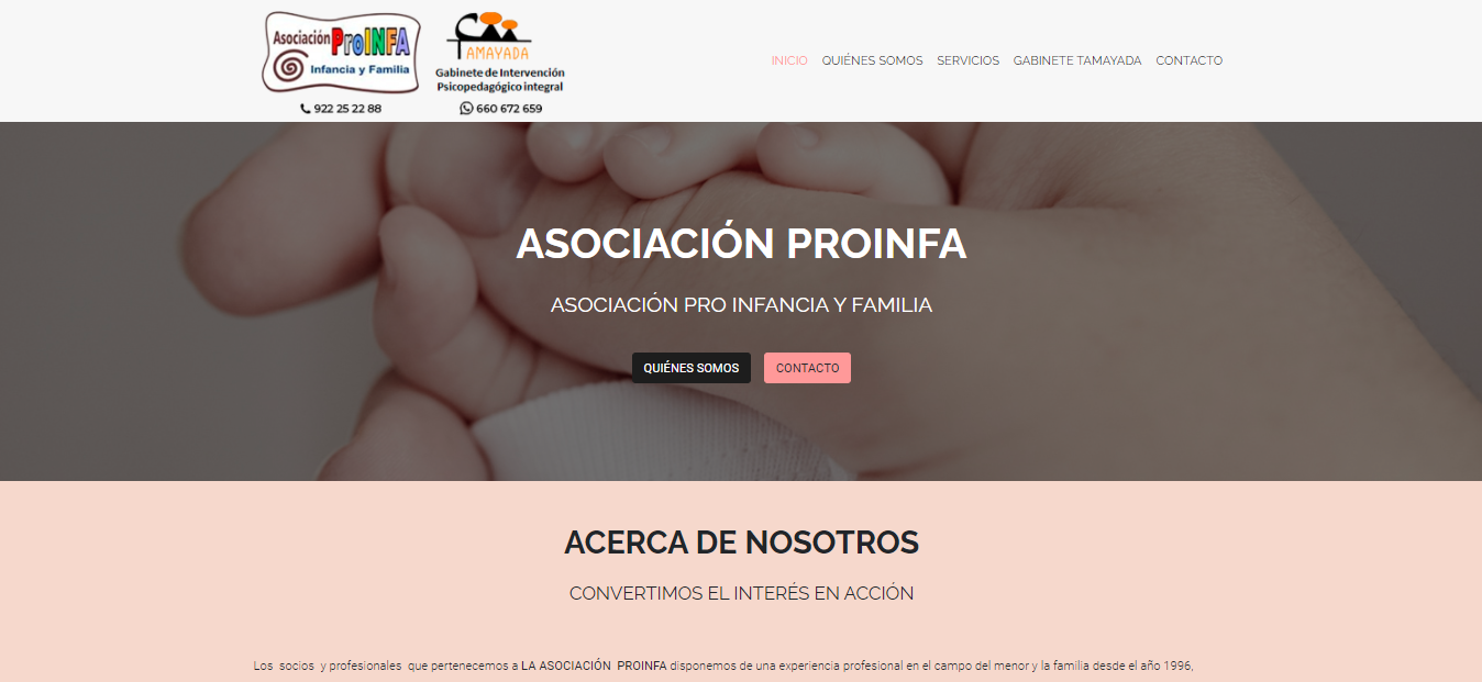 Image: Web of Asociación Proinfa
Black
Conveying elegance, luxury, sophistication, power, formality, and neutrality, black should be used judiciously to avoid negative connotations.
Ideal for luxury products, cosmetics, fashion, and businesses aiming for a sophisticated and formal image.
But it should not be overused; rather, it should be combined with its different shades or other colors, thus avoiding a sinister, dark, and unappealing appearance.
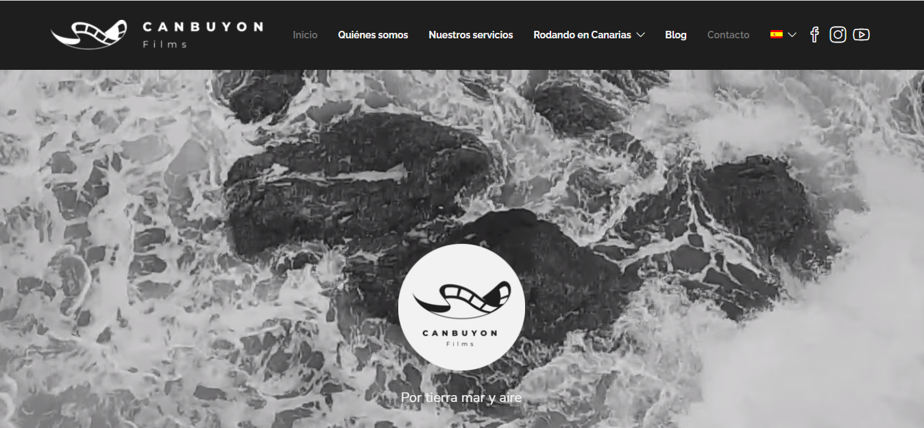 Image: Web of Canbuyon Films
White
Symbolizing purity, transparency, safety, sincerity, peace, and humility, white combines well with any other color, imparting a sense of cleanliness and perfection.
Commonly used by health-related businesses, scientific and technological companies, and luxury brands.
However, using it excessively without contrasting it with other colors can create a sense of lack of content.
 Image: Web of Francis Pérez
In conclusion, the power of colors in web design is undeniable. Their choice conditions users' initial impressions, as colors convey specific sensations and messages.
f you want the best design for your website and the most appealing one for your customers, feel free to Contact us!
Sources:
LYDIA CALERO, La psicología del color en el diseño web
CEI. ESCUELA DE DISEÑO, DISEÑO WEB : COLORES QUE DEBÉIS EVITAR